A friend emailed this question a few days ago: “I’m looking at your mini triptych (recent blog post) and am wondering if your color choices are at all inspired from your life in South America?” (I lived in Venezuela for twenty-four years.)
I responded: “There is absolutely no explanation of where the color choices spring from. I am immersed in making those choices now and as I put colors together they are either bad, okay, or — just the right thing. Sometimes it's about making the major amount of color look better or more intense or maybe about knocking it down a few notches. But it happens in the eyes without any thought processes that I am aware of. And I love to do it.” I want to roll this line of thought about some more. I won’t try to find a better answer.
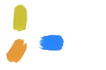
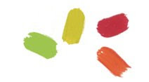
A small amount of blue that leans towards violet will make a large expanse of a pale cool yellow sing. But if it were a blue I wanted to enhance, I would use a bit of red or a muted orange. Yellow wouldn’t do it. Juxtaposing a green with an orange is hard to do well but Elsworth Kelly has perfected that combination in several paintings. Richard Diebenkorn was a master of using a variety of blues together. Howard Hodgkin puts colors together in what might seem an outlandish fashion, doesn’t do anything like what I describe here, and produces an amazingly lush, rich and satisfying color experience. Vincent Van Gogh made marvelous use of orange in his sunflower paintings. He did pretty well with any color he wielded.
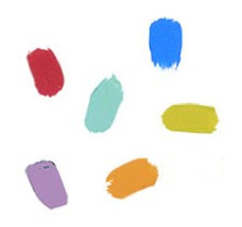
How did they make those choices? One theory that comes to me is that the brain wants color to be complete, the spectrum all there though only part of it is visible. Some colors contain other colors: violet contains blue and red, for example. You know how if you stare at an area of red for a while and then close your eyes, you will see green? That sums up to red + yellow + blue which contain violet, orange and green = complete color. Of course following rules or making formulas won’t work, though they might be helpful. It is the eye that knows. And whatever the part of the brain that exclaims “Yes! That’s it!”. Or “No, absolutely not!” It either looks right; it is complete and alive and radiant, or it fails. Try again.
Sometimes the choice is about the mood of the work (or the worker). It can change from cheerful to somber with the addition or subtraction of a hue or with a transparent glaze. Contrast can be heightened or diminished which might change the tenor of the piece. If there is line, texture, visible brush stroke, blended tones or distinct hard edges, these will all affect the effect.
I have no ability that I trust more than my sense of color but I don’t have a clue about how it really works. My brother and my son are color blind which means that I am a carrier. My therapist makes beautiful color photos and is color blind. Go figure.
The image above is Allegiance, acrylic & mixed media collage on canvas, 9 x 25", 2000. For information about any of the paintings seen on this site please email Joan.
Friday, January 22, 2010
Friday, January 15, 2010
About Rejection
This is a difficult topic to think and write about. It seems somehow more personal than other subject matter, rather something better not spoken of lest one be deemed rejection-able.
The first time I experienced it after becoming a full time dedicated painter happened some thirty years ago. I was crushed. I had answered the doorbell to find the UPS man returning to me several large paintings I had consigned some months prior to a San Diego gallery. There was a letter asking me to send others in their place as they had had no luck with these. I was too distraught and discouraged by the reappearance of works I expected to be readily embraced by an adoring public (well, maybe not exactly expected, more like hoped) to respond by sending new paintings for consignment — big mistake. I felt that I could not possibly send any work anywhere ever again. Yes, it was an overreaction and at some level I was aware of that. So I called a friend, the fabulous Jane Hill, multi-talented actress, playwright and all around arts person, who immediately came to my doorstep. She spent a generous amount of time telling me about auditions and of picking oneself up and going for it again.
I learned. It doesn’t hurt less or nor is it less disheartening. But the restorative thoughts come quickly now: about how Ernest Hemingway papered the room he worked in with rejection slips, how Van Gogh sold nothing during his lifetime, how Mozart was dropped into a pauper’s grave and Schubert acquired his first piano not long before his early death. I’m in good company, I tell myself. I remember my successes and consider how they outweigh the disappointments. I think of all the paintings I have sold over the years and try to recall some of the pats on the back. I will not let the rebuff be a measure of the quality of the work I do nor instill self-doubt. I am my own harshest critic and that will suffice. The painter Elmer Bischoff said: “Success begins and ends in the studio”.
Has it gotten easy? No, it has not. But it has become one of the acceptable attributes of a life worth living.
The image above is Mini Triptych Han, acrylic & mixed media collage, 4.5 x 3" each, 2005. For information about any of the paintings seen on this site please email Joan.
Friday, January 8, 2010
About Creativity
I often hear mention of an individual’s search for creativity, especially from people who are past middle age. It sounds as if it were something precious and elusive that needs to be ferreted out of some hidden place or fabricated and put to use. I’ve also heard: “I’m not very creative”. In point of fact human beings cannot help but be creative. Our creativity has produced our cultures, our cities, our artifacts and our arts.
Contrary to the theory that we become creative when our basic needs are covered, we have become expert at covering those needs. Necessity is the mother of invention, right? Human beings are resourceful and imaginative. We make things. We find solutions.
Here’s Abraham Maslow on the subject: “The key question isn't ‘What fosters creativity?’ But it is why in God's name isn't everyone creative? Where was the human potential lost? How was it crippled? I think therefore a good question might be not why do people create? But why do people not create or innovate? We have got to abandon that sense of amazement in the face of creativity, as if it were a miracle if anybody created anything.”
My experience and what I know of friends who are painters or writers is that it’s about work and focus. Add to that some faith in the worth of your project (not always available but very helpful) and maybe some need for the results. When is a work of art needed? Well, how about a commission or a deadline for a design or a show? Or how about a job where you have to supply copy for advertising, a plan for a structure, or the resolution of a conflict? Creativity is essential in business, economics, architecture, industrial design, graphic design, advertising, mathematics, music, science and engineering. It is also vital when you are in the midst of putting together a recipe and you find that you need to make a substitution for some ingredient. When I was teaching, I found that my students were wizards at creating excuses for not having done the assignments.
Maslow again: “We assume that creativeness consists of lightening striking you on the head in one glorious moment. The fact that people who create are good workers tends to be lost.” And from psychologist Teresa Amabile (slightly paraphrased): “Creativity soars when the artist, or mathematician or cook is concentrating on the task before her and on the intrinsic pleasure and satisfaction of the task.”
Simply put, it is the act of making something new.
The image above is the collage painting Lobelia, acrylic & mixed media on paper mounted on canvas, 23” x 29”, painted in 2006. For information about any of the paintings seen on this site please email Joan.
Contrary to the theory that we become creative when our basic needs are covered, we have become expert at covering those needs. Necessity is the mother of invention, right? Human beings are resourceful and imaginative. We make things. We find solutions.
Here’s Abraham Maslow on the subject: “The key question isn't ‘What fosters creativity?’ But it is why in God's name isn't everyone creative? Where was the human potential lost? How was it crippled? I think therefore a good question might be not why do people create? But why do people not create or innovate? We have got to abandon that sense of amazement in the face of creativity, as if it were a miracle if anybody created anything.”
My experience and what I know of friends who are painters or writers is that it’s about work and focus. Add to that some faith in the worth of your project (not always available but very helpful) and maybe some need for the results. When is a work of art needed? Well, how about a commission or a deadline for a design or a show? Or how about a job where you have to supply copy for advertising, a plan for a structure, or the resolution of a conflict? Creativity is essential in business, economics, architecture, industrial design, graphic design, advertising, mathematics, music, science and engineering. It is also vital when you are in the midst of putting together a recipe and you find that you need to make a substitution for some ingredient. When I was teaching, I found that my students were wizards at creating excuses for not having done the assignments.
Maslow again: “We assume that creativeness consists of lightening striking you on the head in one glorious moment. The fact that people who create are good workers tends to be lost.” And from psychologist Teresa Amabile (slightly paraphrased): “Creativity soars when the artist, or mathematician or cook is concentrating on the task before her and on the intrinsic pleasure and satisfaction of the task.”
Simply put, it is the act of making something new.
The image above is the collage painting Lobelia, acrylic & mixed media on paper mounted on canvas, 23” x 29”, painted in 2006. For information about any of the paintings seen on this site please email Joan.
Friday, January 1, 2010
About the Pleasure Factor
I have discovered that the joy I feel when I am submerged in making a painting becomes somehow, mysteriously, visible. Is the enjoyment I feel in the process so obvious? What are the experiences and desires the viewer brings?
There are a great many qualities that can be present in a work of art. I will name some and mention some painters that come to mind. Drama: Francisco Goya, Pablo Picasso; Fine drawing: Rembrandt van Rijn, Jean Auguste Ingres; Luscious color: Richard Diebenkorn, Mark Rothko; Delicious use of paint: Sean Scully, Howard Hodgkins, Jasper Johns; Elegant design: Paul Klee, Elsworth Kelly, Piet Mondrian, Henri Matisse, Sol LeWitt; Pattern: Pierre Bonnard, Gustav Klimt. There are also political statements and social commentary and, of course, sentimentality. Paintings can be intended to produce an emotional response in the viewer (only successful if the painter is feeling the emotion): Picasso’s Guernica, for example, otherwise just manipulative of the viewer. That’s the tip of the iceberg; there are more elements to be found in paintings and as many amalgamations of them as there are and have been painters.
Some of my own opinions and biases are: skill in painting is the least interesting of the ingredients in a work of art, necessary to a point but dangerous to the painter as it can become the reason for the painting. Good taste is the kiss of death. I want some kind of delight. Think JMW Turner, Claude Monet. The artists I mention are not necessarily the artists I have emulated and learned from. They are some of those that I admire and enjoy and am happy to see again and again.
Agnes Martin (very fine drawing) said: “The function of artwork is the stimulation of the sensibilities.” I guess our preferences have to do with which of our sensibilities we want to prod.
The image above is Fountain, acrylic & mixed media on paper mounted on canvas, 35” x 92”, painted in 1999. For information about any of the paintings seen on this site please email Joan.
There are a great many qualities that can be present in a work of art. I will name some and mention some painters that come to mind. Drama: Francisco Goya, Pablo Picasso; Fine drawing: Rembrandt van Rijn, Jean Auguste Ingres; Luscious color: Richard Diebenkorn, Mark Rothko; Delicious use of paint: Sean Scully, Howard Hodgkins, Jasper Johns; Elegant design: Paul Klee, Elsworth Kelly, Piet Mondrian, Henri Matisse, Sol LeWitt; Pattern: Pierre Bonnard, Gustav Klimt. There are also political statements and social commentary and, of course, sentimentality. Paintings can be intended to produce an emotional response in the viewer (only successful if the painter is feeling the emotion): Picasso’s Guernica, for example, otherwise just manipulative of the viewer. That’s the tip of the iceberg; there are more elements to be found in paintings and as many amalgamations of them as there are and have been painters.
Some of my own opinions and biases are: skill in painting is the least interesting of the ingredients in a work of art, necessary to a point but dangerous to the painter as it can become the reason for the painting. Good taste is the kiss of death. I want some kind of delight. Think JMW Turner, Claude Monet. The artists I mention are not necessarily the artists I have emulated and learned from. They are some of those that I admire and enjoy and am happy to see again and again.
Agnes Martin (very fine drawing) said: “The function of artwork is the stimulation of the sensibilities.” I guess our preferences have to do with which of our sensibilities we want to prod.
The image above is Fountain, acrylic & mixed media on paper mounted on canvas, 35” x 92”, painted in 1999. For information about any of the paintings seen on this site please email Joan.
Friday, December 25, 2009
About Rules
I have learned about painting by looking at paintings and I learned about painting at school.
But mostly I have learned about painting by painting. In order to make paintings that meet the need that provokes the output, I have to put aside most of the rules and learning that have come from outside of myself — except for the purely technical information. It is too easy to make a painting that looks like a painting and therefore is a painting. When I was at school, there was a lot of talk, when “critiquing” a painting in progress, about depth. Paintings had to manifest an illusion of three dimensions. We didn’t need that deceit when we were in the classroom of Two Dimensional Design, nor when we were learning calligraphy.
Space was an essential consideration in the architecture classroom and the sculpture lab, and definitely to be desired in a painting. I was halfway through my life (assuming I will last until eighty or ninety), when I realized that I hated that deception. I love the flatness of a canvas or a sheet of paper. I do not want to destroy it with a mirage. I want to consider the entire rectangle, (or square, don’t like circles or triangles or any other roundish or angular shapes for paintings), and keep every bit of it looking as flat as it is to start with. I was so accustomed to envisioning object and background, or foreground, middle ground and background, that I had to struggle to see differently and work differently. That struggle is behind me now; I see and paint what I consider realism: paint and/or other media on a flat surface, no illusion of depth intended. I have no quarrel with seeing space in other painters’ work, just don’t want it in mine.
At my last show, a number of people commented on the depth they saw in my paintings. Well, what do you do? Paintings are for the eye of the beholder. I am comfortable with whatever it is that viewers bring to my work and very often surprised and enlightened.
The image above is the Nostalgia Quartet, acrylic & mixed media collage on archival board, 19.5” x 14.5” each panel, painted in 2008. For information about any of the paintings seen on this site please email Joan.
Friday, December 18, 2009
About Words
The artist is required to speak and write about her work. I am asked: “What kind of painting do you do?” An artist’s portfolio must include an Artist’s Statement. We are told to speak of the why and wherefore of what we make visible with our tools and materials. As the artist changes and grows, so must the statement.
Needless to say, for most of us the written word is a greater challenge than the art we produce. Especially when the words are meant to give understanding to what we have already made visible. We want the work of art to speak for itself, to stand alone, strong, needing no props.
But we are told that the words are necessary so we write them and insert them into the packets we present to the galleries and art consultants that we want to connect with. We print out the words and hang them on the walls of the galleries when we exhibit the work. We use them for press releases and other kinds of promotional outreach. And we revise and revise and revise. We change; the work changes.
I recently found in my files a statement I wrote I don’t know how many years ago. It might as well have been written by somebody else. I am no longer that person nor am I that painter. From that old statement: “My painting is about some of the things I find beautiful. Mostly it’s a shape, a mood, a human gesture.” From a later statement: “My painting is about color. I present it without reference to anything outside the painting.” And from the statement I am using now: “The focus of my work is luminous color. I paint on paper which I assemble into paintings by composing the panels into groups and adhering them to canvas or board.”
Same painter metamorphosing into the painter she wants to be.
The image above, The Good Apple, painted in 1978, is of the same mind as the oldest statement excerpted here. I still like the painting and am proud of it. But I don’t want to do that kind of painting now.
Friday, December 11, 2009
About Scale
TIME OFF, pictured here was photographed before completion. If you look closely you might notice that a lot of the elements are taped in place. It was finally mounted on canvas and measures 62 x 198 inches.
At a very pleasant dinner party recently, my friend and hostess Jane, asked me to address the subject of scale. I have worked from tiny (3.5 x 2 inches) to very large (62 x 198 inches) but I have not given a lot of thought to scale. While I have heard it said that small is as much a challenge as large, there is definitely some contrast. What is the same (and I speak only from personal experience) is the attention. The involvement with the project at hand, that effort to “get it right” seems the same. The difference lies in seeing the work — how far from it you need to get to see it and then how to keep that image in mind when you are close up and nose to the canvas (or whatever the surface) again. Therein lies some of the greater challenge of a large work. And then of course there is the pure physicality of working on something really big — just getting from one part of it to another and — yikes! Moving it! The canvas pictured here was stapled to the wall; my son helped me get it up there; my daughter watched over me as I adhered the painted squares in place (using a diagram to be sure I was putting each where it belonged), and a group of talented young interns from the First Street Gallery took it down, rolled it and rehung it for the show I had with Humboldt State University. I was totally daunted by the process and amazed at how well these young people handled it.
So why work that large? Well, mostly for the presence and majesty that something that large can have, though clearly not all big paintings make the grade. Robert Motherwell translated a very small gestural sketch into an enormous painting that hangs at the National Gallery in Washington DC. The original little one had the energy of his hand and the life in him. The big one, which I raced up the stairs to see when I got to the museum, was totally dead. A zombie. In the next room was a huge painting by Mark Rothko that caught me by surprise and brought tears to my eyes. It was wonderfully beautiful. Rothko said he wanted his viewers to enter into his paintings and so made them large enough for that. This one sucked me right in. The large size in Rothko’s hands and in some of Motherwell’s more successful works, becomes heroic. There’s a power to command your attention when the artist deals well with that scale. So why work small? The answer for me is for the intimacy of the process and its result. You must stay close as you work; you can always hold it in your field of vision, and the viewer must get close to see it. I like all of that.
There it is, Jane. I have addressed the subject of scale, a personal view. Comments always gratefully accepted.
P.S. If you haven’t already subscribed to this blog, please do. Just go to the Feedblitz icon in the sidebar, put in your email address and follow the instructions. You will then receive the posts as email with the images and links back to the blog. I really like writing it and want to have an audience for my prattle. It is the best remedy I have found so far for the loneliness that can come from so much working in solitude. And any comments you are inspired to leave (where it says “Comments” below the posts) are truly welcome.
At a very pleasant dinner party recently, my friend and hostess Jane, asked me to address the subject of scale. I have worked from tiny (3.5 x 2 inches) to very large (62 x 198 inches) but I have not given a lot of thought to scale. While I have heard it said that small is as much a challenge as large, there is definitely some contrast. What is the same (and I speak only from personal experience) is the attention. The involvement with the project at hand, that effort to “get it right” seems the same. The difference lies in seeing the work — how far from it you need to get to see it and then how to keep that image in mind when you are close up and nose to the canvas (or whatever the surface) again. Therein lies some of the greater challenge of a large work. And then of course there is the pure physicality of working on something really big — just getting from one part of it to another and — yikes! Moving it! The canvas pictured here was stapled to the wall; my son helped me get it up there; my daughter watched over me as I adhered the painted squares in place (using a diagram to be sure I was putting each where it belonged), and a group of talented young interns from the First Street Gallery took it down, rolled it and rehung it for the show I had with Humboldt State University. I was totally daunted by the process and amazed at how well these young people handled it.
So why work that large? Well, mostly for the presence and majesty that something that large can have, though clearly not all big paintings make the grade. Robert Motherwell translated a very small gestural sketch into an enormous painting that hangs at the National Gallery in Washington DC. The original little one had the energy of his hand and the life in him. The big one, which I raced up the stairs to see when I got to the museum, was totally dead. A zombie. In the next room was a huge painting by Mark Rothko that caught me by surprise and brought tears to my eyes. It was wonderfully beautiful. Rothko said he wanted his viewers to enter into his paintings and so made them large enough for that. This one sucked me right in. The large size in Rothko’s hands and in some of Motherwell’s more successful works, becomes heroic. There’s a power to command your attention when the artist deals well with that scale. So why work small? The answer for me is for the intimacy of the process and its result. You must stay close as you work; you can always hold it in your field of vision, and the viewer must get close to see it. I like all of that.
There it is, Jane. I have addressed the subject of scale, a personal view. Comments always gratefully accepted.
P.S. If you haven’t already subscribed to this blog, please do. Just go to the Feedblitz icon in the sidebar, put in your email address and follow the instructions. You will then receive the posts as email with the images and links back to the blog. I really like writing it and want to have an audience for my prattle. It is the best remedy I have found so far for the loneliness that can come from so much working in solitude. And any comments you are inspired to leave (where it says “Comments” below the posts) are truly welcome.
Subscribe to:
Posts (Atom)