
I responded: “There is absolutely no explanation of where the color choices spring from. I am immersed in making those choices now and as I put colors together they are either bad, okay, or — just the right thing. Sometimes it's about making the major amount of color look better or more intense or maybe about knocking it down a few notches. But it happens in the eyes without any thought processes that I am aware of. And I love to do it.” I want to roll this line of thought about some more. I won’t try to find a better answer.
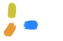
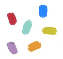
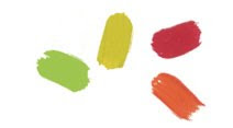
A small amount of blue that leans towards violet will make a large expanse of a pale cool yellow sing. But if it were a blue I wanted to enhance, I would use a bit of red or a muted orange. Yellow wouldn’t do it. Juxtaposing a green with an orange is hard to do well but Elsworth Kelly has perfected that combination in several paintings. Richard Diebenkorn was a master of using a variety of blues together. Howard Hodgkin puts colors together in what might seem an outlandish fashion, doesn’t do anything like what I describe here, and produces an amazingly lush, rich and satisfying color experience. Vincent Van Gogh made marvelous use of orange in his sunflower paintings. He did pretty well with any color he wielded.
How did they make those choices? One theory that comes to me is that the brain wants color to be complete, the spectrum all there though only part of it is visible. Some colors contain other colors: violet contains blue and red, for example. You know how if you stare at an area of red for a while and then close your eyes, you will see green? That sums up to red + yellow + blue which contain violet, orange and green = complete color. Of course following rules or making formulas won’t work, though they might be helpful. It is the eye that knows. And whatever the part of the brain that exclaims “Yes! That’s it!”. Or “No, absolutely not!” It either looks right; it is complete and alive and radiant, or it fails. Try again.
Sometimes the choice is about the mood of the work (or the worker). It can change from cheerful to somber with the addition or subtraction of a hue or with a transparent glaze. Contrast can be heightened or diminished which might change the tenor of the piece. If there is line, texture, visible brush stroke, blended tones or distinct hard edges, these will all affect the effect.
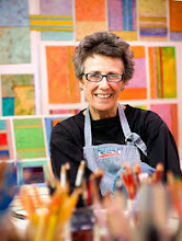
I have no ability that I trust more than my sense of color but I don’t have a clue about how it really works. My brother and my son are color blind which means that I am a carrier. My therapist makes beautiful color photos and is color blind. Go figure.
The image above is Allegiance, acrylic & mixed media collage on canvas, 9 x 25", 2000. For information about any of the paintings seen on this site please email Joan.


No comments:
Post a Comment